Thursday, 22 December 2016

Photo Mentor Project


Andre Kertesz


Andre Kertesz was born in Budapest July 2nd, 1894.  Originally named Kertesz Andor he lived with his middle-class Jewish family with his Mother, Father, and two brothers.  After earning enough money Andre disobeyed his parent’s wishes for him to pursue a career in business and bought a camera.  In his free time, Andre would take photos of things we might see on a daily basis and give them a deep meaning.  

Image result for the fork andre kertesz
The first photo depicts a fork leaning up against a plate.  This photo is called “the Fork” it was taken in Paris in 1928.  This photo represents a utensil people use everyday to represent their lives and the shadow represents the dark secrets they keep from other people.  This relates to his main style of taking a photo of things people see daily (the Fork) and adding a deep meaning to the photo.  This photo is one of Andre's most famous pictures.  The fork was used in the ‘Salon de l’Escalier’ (Paris, 1928) and at ‘Film und Foto’ (Stuttgart, 1929) and was used in an 
advertisement for the silversmiths Bruckman-Bestecke.


Image result for andre kerteszThe second photo is untitled and it was taken in Meudon, France in 1928. The photo depicts a street leading under a bridge with a train going on top.  People could say the photo that the photo looks like an average day walking in town at this time period. The meaning of this photo is thought that the man in the foreground could be the German painter Willi Baumeister, and the package he is carrying the stretcher of a canvas. Kertész had known him since 1926 when he took a photo of him.  This photo was taken with a Leica.  This camera first appeared in Germany in the 1920s. Kertész began using one in 1928, the reason this camera is used so often by photojournalists is because it was light and easy to handle.


Image result for mondrian's glasses and pipeThe final photo is named Mondrian's Pipe and Glasses, it was taken in Paris in 1928.  The photo was first shown in 1927 at the Au Sacre du Printemps gallery.  Andre portrayed this by taking a photo of two pairs of glasses, one on its side and one standing up on the lenses, and a pipe sitting in an ashtray.  The objects are owned by famous painter Piet Mondrian who painted very abstract paintings hence the name “Mondrian’s Pipe and Glasses. This goes back to his main style of showing everyday objects (The pipe and glasses) and giving them a deep meaning of placing them in abstract ways to show the style of the owner’s paintings.


Andre was a photojournalism legend and many photojournalists today give credit to him for inspiring them.  Many try to replicate his style but very few are able to recreate his sense of perspective on the world and its creations.  In an interview with the famous photographer, Henri-Cartier Bresson he said; “We all owe something to Kertesz, Whatever we have done, Andre did first”.


My Photo Interpretation

My photo was taken with a Nikon D3100 with a f2.6 Aperture and a 1/100 Shutter speed.  The photo is of a door with the number 19 on it.  Just looking at it you would not think it would have a very deep meaning but that is not the case.  The meaning of this photo is that the door is to entrance to adulthood.  I showed that it was the door to adulthood and not just a random door because of the number.  The number is 19 which represents the age you are considered an adult and not a minor any more.  I think this imitated Andre Kertesz photos because it is a simple object (A door) and it has a deep hidden meaning (The entrance to adulthood)


References


Lafer, Sarah, 2011. Retrieved December 20, 2016 from http://cargocollective.com/arthauslondon/Andre-Kertesz

Andre Kertesz, Retrieved December 20, 2016 from https://sites.google.com/site/andrekerteszphotographs/photography/the-fork

Wikipedia, Andre Kertesz, Retrieved December 20, 2016 from https://en.wikipedia.org/wiki/Andr%C3%A9_Kert%C3%A9sz

Wan, Leo,  2016. Artist Mentor Project, Retrieved December 20, 2016 from http://nexusvaporotart.blogspot.ca/


Monday, 12 December 2016

Marketable Object


For my marketable object I chose to do silk screen.  The reason I chose silk screen was because you can easily print a photo onto an article of clothing or any fabric like a bag or a t-shirt.  The photo I chose to use was one I took a ticket I found in my house.  The reason I chose this photo is because it looks like it could make a cool logo for a brand.

How I would market this logo is by printing it on clothing and branding it as "Admit One".  The logo is printed in the colour red and not placed right in the middle or on the side but just a little bit off those areas which makes the print unique to the brand.

There are two different styles to the print:

#1: Solid Print,    The solid print is when the logo is fully filled with colour and looks brand new.

#2: Worn Print,   The worn print is when the logo looks like it is very old.   How I achieved this print is by using a thin layer of paint and sliding the squeegee once across the silk screen so the paint runs out before it reaches the end.


These 3 Following Photos are of the Solid Print.


These 3 Following Photos are of the Worn Print.


Friday, 9 December 2016

Alternative Processes


#1:  Gel Medium

The Theme for my gel medium photo was Balance.  On one side of the photo there is a tower of rocks which has many different sizes of stones forming the sculpture but is still able to balance with ease.  The other side has a picture that i took of a buddha sculpture i found in the class, Balance is a bit deeper in this part of the photo but it still follows the theme.  Buddhism, the religion that believe buddha to be god is very often associated with the art of yoga.  Performing yoga poses requires a lot of balance to hold the position without toppling over so thats why I included a photo of this statue.  How I made this photo was by first photoshopping the rocks into the photo with the statue and I also made the rocks more opaque so they would blend better into the background.  Once the photo was finished I printed it out taped it down to a wooden board and started the process and painting on the layers of gel medium and drying.  Once applying around 10 layers I washed off all of the paper off of the back and the gel medium photograph was complete.


#2: Photogram


The photogram is a process of exposing photo paper to light while placing various objects on them so that those certain areas would stay white.   What i used for my photogram was: A lid of a glue stick, a lid of a film canister, popsicle sticks cut into sword like shapes, pieces of construction paper i cut out to look like bodies in a fighting stance, and paper letters i cut to form the word on the bottom of the photo.   The meaning of my photogram is "Fighting over Nothing".  Basically what this means is nowadays people fight over such minimal things such as who gets the last playstation on a black friday sale or who gets to control the remote.  How I portrayed this meaning in my photogram was by having two stick figures fighting over the word "nothing".  I think I showed the theme pretty well because it is very literal and simple,  but also would take a few seconds to understand what it really means.


Tuesday, 22 November 2016

Photo Journalism


Photo Journalism


Shot with Nikon D3300


f12 Aperture


1/100 Shutter Speed


It is very unusual to see a photo from this angle in Oakville.  You normally do not get a look down on the street from up above and being able to see the roof of buildings and shops you have entered.  The street in the photo is Randall street a road parallel to Lakeshore.  The sun is setting and the sky is starting to turn an orange color.  In the day we went to many places like Gairloch Gardens and the train tracks by the go station and took many shots which can be found below. How we came upon this spot was we were on our way to the park by the lake when we saw the parking garage and decided to go up to the top and take some photos of the streets and buildings below.

This picture was taken a top of a parking garage in downtown Oakville.  Why I chose this photo for the front cover of the newspaper is because the photo has perspective and depth.  The other reason why I chose this photo for the front page is because it gives you a different angle on a familiar street and gives a good example of what the day was like.  Another reason why I chose this photo is because it follows many rules of composition such as Rule of Thirds, and the road draws your eyes down the photo.


Wednesday, 16 November 2016

Breaking The Rules


Breaking The Rules

The aim of this project was to break the rules of composition while still keeping the photo visually appealing.


Rules of Composition

  • Fill The Frame / Cropping.
  • Don't Cut Off Limbs.
  • Understand The Rule Of Thirds.
  • Use Frames.
  • Make The Most Of Lead In Lines / Shapes.
  • Simplify – Know Your Focus.
  • Watch The Background.
  • Look For Symmetry/Patterns.


    This photo is of a tree with branches sticking out randomly all over and a squirrel sitting on top of one.  This photo was shot with f5.6 Aperture at a 1/100 shutter speed with the Nikon D3100.  The rules of composition I broke was a Simple Background and Lines.  How I broke the rule of keeping a simple background was by taking the photo under the tree so you can see all of the branches and leaves from other surrounding trees.  How I broke the rule of lines was by having branches poking out in all different directions.  How breaking the rules made this photo better was the messy background gives the effect that you are in a big forest and surrounded by trees.


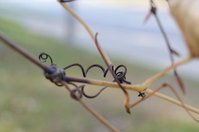
The Photo above is of a brach with a small swirly twig wrapping itself around the branch.  This photo was shot with a f2.8 Aperture and a 1/60 shutter speed also with the Nikon D3100.  The rules of composition I broke are: The rule of thirds, Lines, and Cutting off limbs.  How I broke the Rule of thirds was by having the main focus (the swirly twig) right in the middle of the photo completely breaking the rule.  How I broke the rule of lines is the branches in the photo do not specifically lead your eye anywhere.  Finally the way I broke the rule of not cutting off limbs was by cropping off the branch so you can not see where it attaches onto.  How i think breaking the rules made this photo better was not having rule of thirds implemented made the twig more emphasized,  Also cropping the branches off made it so your eyes do not get drawn to other objects.


The last photo I shot was a picture of a padlock locking a fence with a rusty chain.  This photo was taken with f4 Aperture and a 1/100 shutter speed with the Nikon D3100.  The rules of composition I broke in this photo was:  The subject is out of focus, and a simple background.  How I broke the rule of not keeping my subject (the padlock) in focus was by focusing on the chain and then your eyes gets lead to the lock.  I broke the rule of a simple background by taking the photo if front of a big object.  How I think breaking the rule of a simple background made the photo look like the lock and chain was keeping something safe and secure and if it didn't have that object behind it it would just be a locked gate. 


All of the photos above were taken with the nikon d3100.  The photo of the Squirrel and Tree were taken with a f16 and f22 aperture and a 1/100 and 1/250 shutter speed while the rest were taken with f5.6 aperture and 1/60 Shutter Speed.

Friday, 11 November 2016

Mixed Lighting


The Point of this Project was to take photos with daylight and an artificial source such as a Flashlight, External Flash, Studio Lights, etc.  These photos were all taken with a f5.6 Aperture, 1/250 for the first 2 and 1/1000 for the last one.  I had a fast shutter speed for the last photo because I wanted to capture the water without any motion blur.

For the first picture how I showed mixed lighting by shining a flashlight down at the lock so it reflected off of the metal rung into the camera making it seem it was very shiny.  The composition rules I used were rule of thirds, a simple background and the lines on the door in the background are strait making it visually pleasing.

The second picture I showed mixed lighting by shining the flashlight on the poles connecting the arm holder to the ground making small highlights in the middle.  The flashlights light is not very big but it makes a big difference.  This photo shows composition with lines the far arm holder in the background lines up perpendicular with the poles in the foreground.

The Third picture I showed Mixed Lighting by using the flash on the camera, the ceiling light and the daylight coming through the nearby window.  What i did was take a picture so the camera flash would illuminate the fountain of water.  One thing i like about this picture is the ripples when the water hits the bowl of the fountain.  This photo uses composition by showing rule of thirds.


The Photo above is my Contact sheet which has an assortment of mixed lighting experiments.  I used the flashlight for all these photos and except for the photo of the Canada flag which used the ceiling lights instead.  All the photos except the flag one used f5.6 aperture and 1/200 shutter speed and the flag had a f12 aperture with a 1/200 shutter speed.


Wednesday, 2 November 2016


Painting With Light


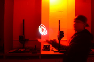
All of these shots were taken with 15 second
Shutter Speed and a f5.6 Aperture.


These shots were the 4 best ones


The ones below are my experiments


What I was trying to achieve with photos 1 and 3 were i was trying to write words with with flashlight.  I wrote red in the first one because of the red background and I just wrote my name in the 3rd.  In the second photo what i was attempting is the illusion i was holding a ball of light.  The last photo my attempt was to make it look like there was a lightning bolt shooting out of the light above.

                              ^^^^^^^^^^^^^^^      Contact Sheet     ^^^^^^^^^^

All of these shots were also shot with 15 second shutter speed and
f5.6 Aperture.


Saturday, 29 October 2016

Renaissance Photoshop Assignment


The title of this work of art is called: Salome with the Head of John the Baptist. The painting was created in 1607 in the Baroque period. The Medium for this piece is Oil on Canvas and was painted by an artist named Caravaggio.

Caravaggio was born in 1571 and died at the young age of 38 in 1610. The mood of this painting is very dark and my initial reaction was I thought he was drinking out of a bowl but then on further inspection I realized it was not the case.

What is represented in this painting is a Women holding the head of Saint John the Baptist.

I think the focal point of the painting is head because the women standing beside him is looking at the head so it draws your eyes. I Think this painting is very effective because its simple but it has a deep message.

Some elements of composition this painting has is simplicity because the background is all black. Some elements composition are missing in this painting like the rule of thirds and also there is a cut off limb.

The reason I chose this painting was because there were 2 of us working together and this painting had two subjects.

The culture of era is very religious and this photo has a very important religious figure "Saint John the Baptist"

The Baroque time period was known to have very exaggerated motion and clear, easily interpreted detail to produce drama, tension, exuberance, and grandeur in sculpture, painting, architecture, literature, dance, theater, and music. I think this painting reflects on these characteristics because it is very dramatic and it is easily interpreted.


References

https://en.wikipedia.org/wiki/Caravaggio
https://en.wikipedia.org/wiki/The_Beheading_of_Saint_John_the_Baptist_(Caravaggio)

Monday, 24 October 2016

Studio Lighting


Studio Lighting


Shot with a Nikon d3300 with a 18-55mm lens
Aperture: 3.5 Shutter Speed: 1/200

-----------------------------------------------------------------------------------------------------

Contact Sheet


Shot with Canon 7d: all shots have 5.6 Aperture with 1/60 Shutter Speed.

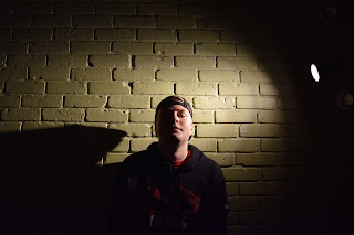
The First three pictures portray main light because it is a single light pointing at one side of the subjects face.

The 4th and 5th portrait are both back light except the first is just the back light and the 5th has a reflector reflecting the back light on to the front of the face.

The last portrait was more of an experiment what the attempt was to have a light behind the camera then the subject had a small mirror reflecting the light back onto the camera which is what the bright circle in the mirror is.

The mood of the first 4 portraits were to have a dramatic effect and really emphasize the subject.  Then the last portrait was to give the effect that the subject was hiding and try to make him sort of fade into the background.


Wednesday, 12 October 2016

Alphabet Banner


          The project was to create your name with natural forming letters around the school.  The way I found most of my letters was by trying to find where different metal beams and lines crossed each other.  Then I would find the right angle where you could recognize the structure as a letter in the alphabet.  Once all the pictures were taken I uploaded the photos to google drive then photoshopped them onto a banner.

First Post